April Match Campaign
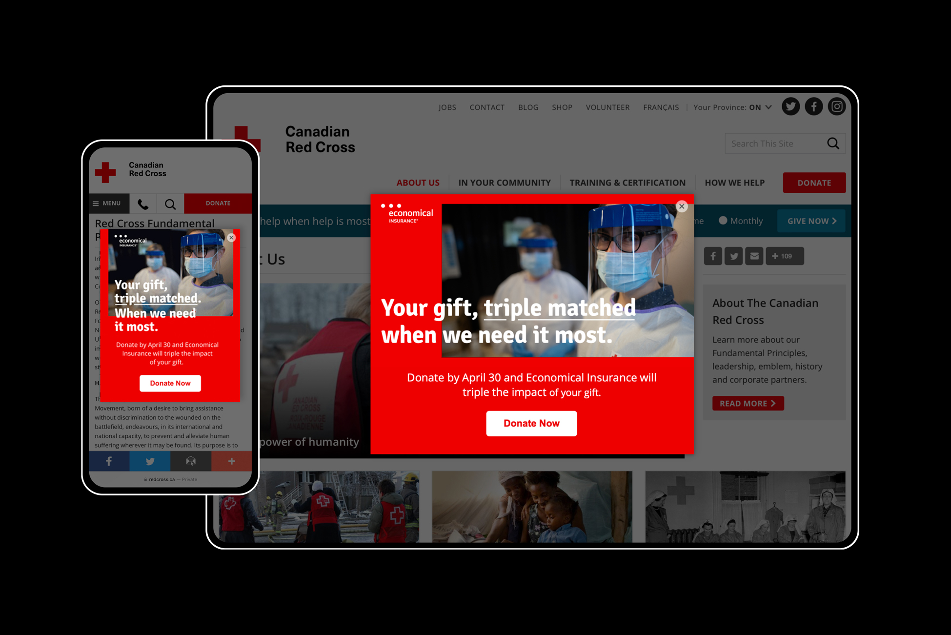
Created a unique look and feel that stood apart from other Red Cross digital campaigns
The Canadian Red Cross Match campaign, launched in 2012, is an annual April fundraiser that has raised millions of dollars. As lead designer, I created a distinctive look and feel for the Match campaign that could be iterated on in future years, and developed a style guide for use in subsequent campaigns.

ROLES
Lead designerArt directionBrandingMarketing + Emails
BRANDING
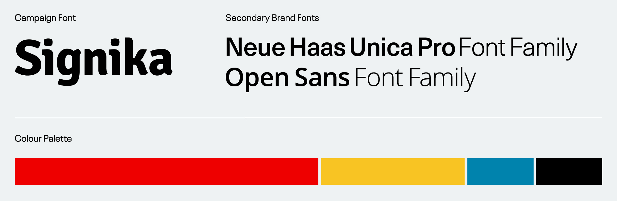
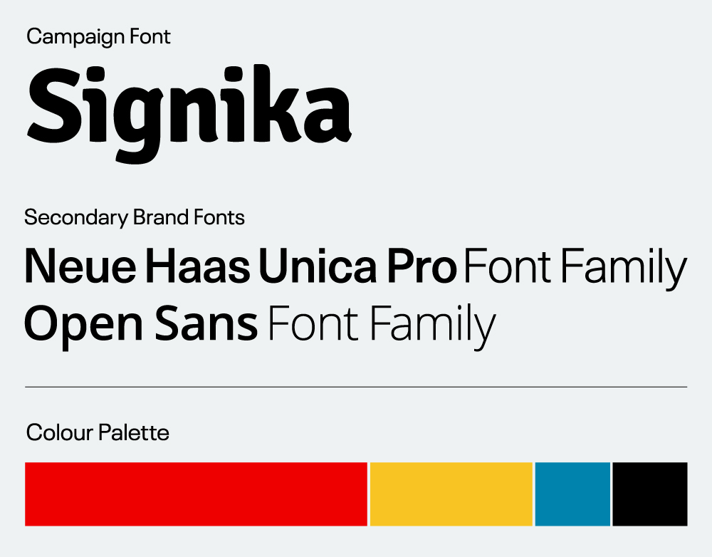
I introduced the font Signika and the colour yellow to complement the existing Canadian Red Cross branding.
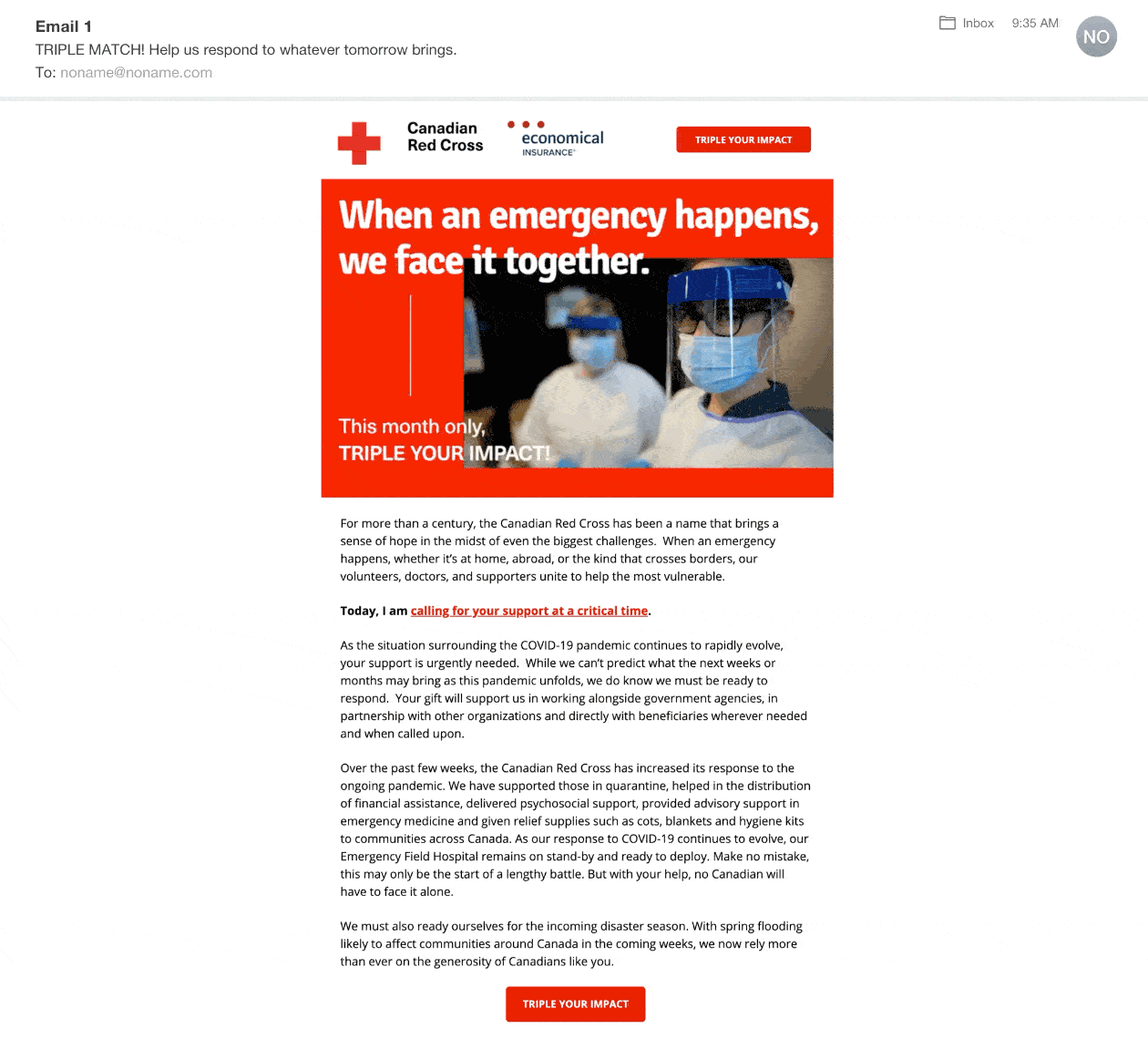
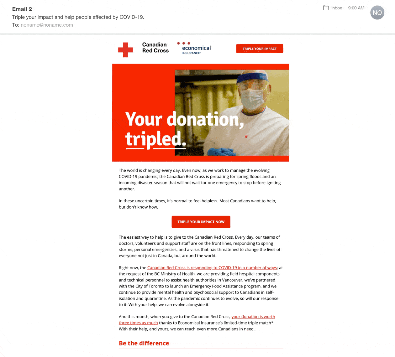
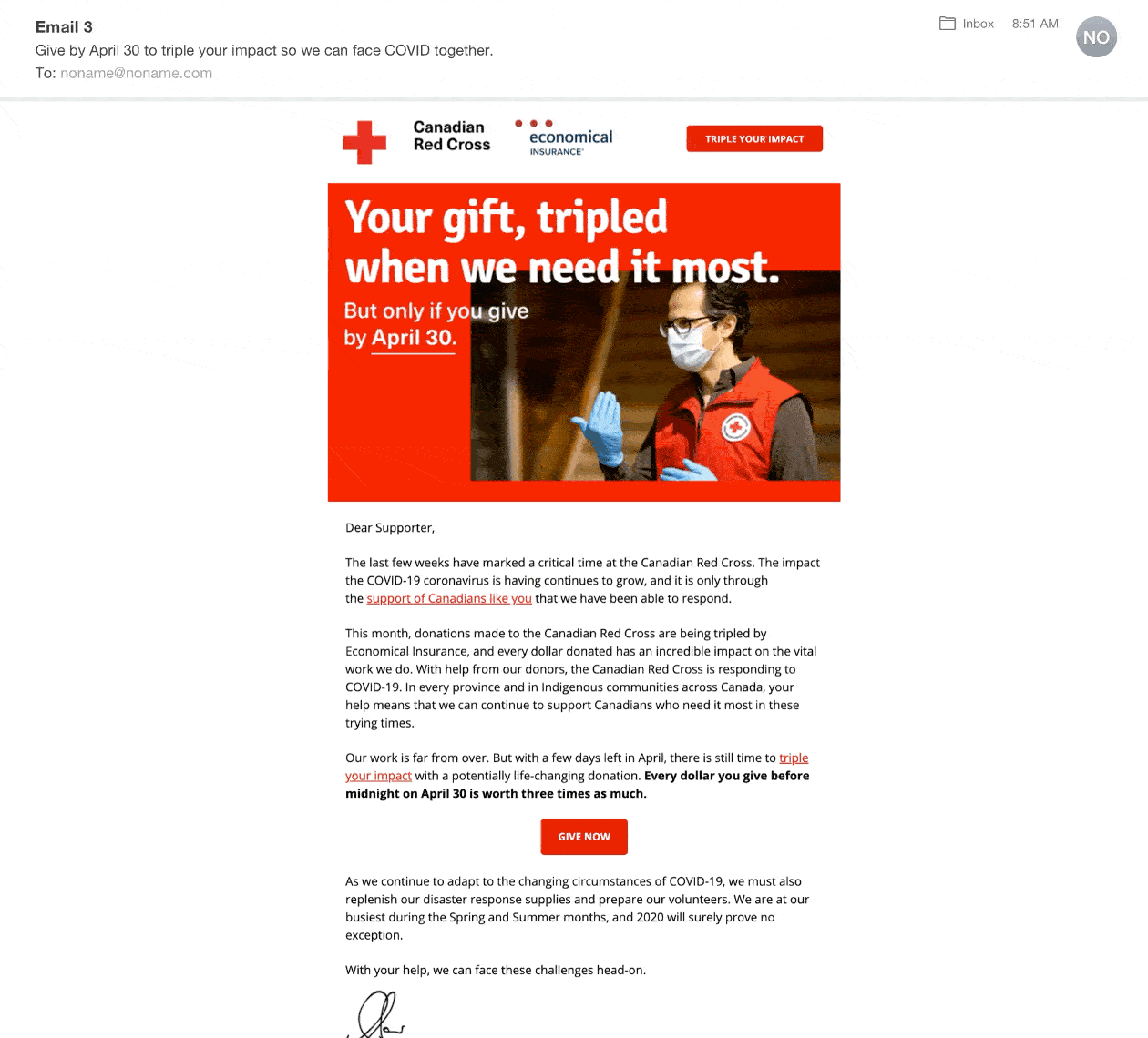
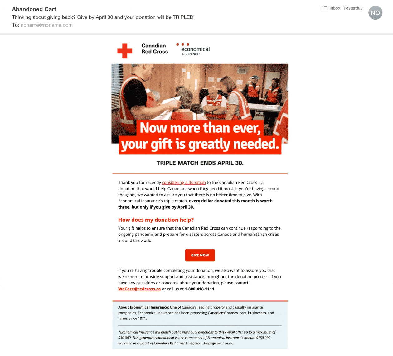
Redesigned in 2 weeks before launch due to COVID-19 and earned more than $2 million dollars.
During the initial wave of the pandemic in March, we pivoted the campaign to reflect the "New Normal," emphasizing to potential donors the crucial role they play in helping the Red Cross respond to the virus.
TOOLS
Campaign Monitor: email marketingUnbounce
April Match Campaign
Created a unique look and feel that stood apart from other Red Cross digital campaigns
The Canadian Red Cross Match campaign, launched in 2012, is an annual April fundraiser that has raised millions of dollars. As lead designer, I created a distinctive look and feel for the Match campaign that could be iterated on in future years, and developed a style guide for use in subsequent campaigns.
ROLES
Lead designerArt directionBrandingMarketing + Emails
BRANDING
I introduced the font Signika and the colour yellow to complement the existing Canadian Red Cross branding.
Redesigned in 2 weeks before launch due to COVID-19 and earned more than $2 million dollars.
During the initial wave of the pandemic in March, we pivoted the campaign to reflect the "New Normal," emphasizing to potential donors the crucial role they play in helping the Red Cross respond to the virus.
TOOLS
Campaign Monitor: email marketingUnbounce