April Match Campaign
Art Direction
The Canadian Red Cross Match campaign was started in 2012, and has become a key fundraising initiative that runs annually through the month of April. It has raised millions of dollars to date.
I was tasked with creating a look and feel for the Match campaign that would stand out from other digital campaigns, as well as one that could be iterated on over subsequent campaign years. This look and feel was carried into the development of a style guide for others to use as a starting point in subsequent years.
The biggest challenge was creating a look and feel that was in-line with the Red Cross branding, but also stood out as unique from other Canadian Red Cross initiatives. To do this, we introduced different elements that worked with the existing brand.
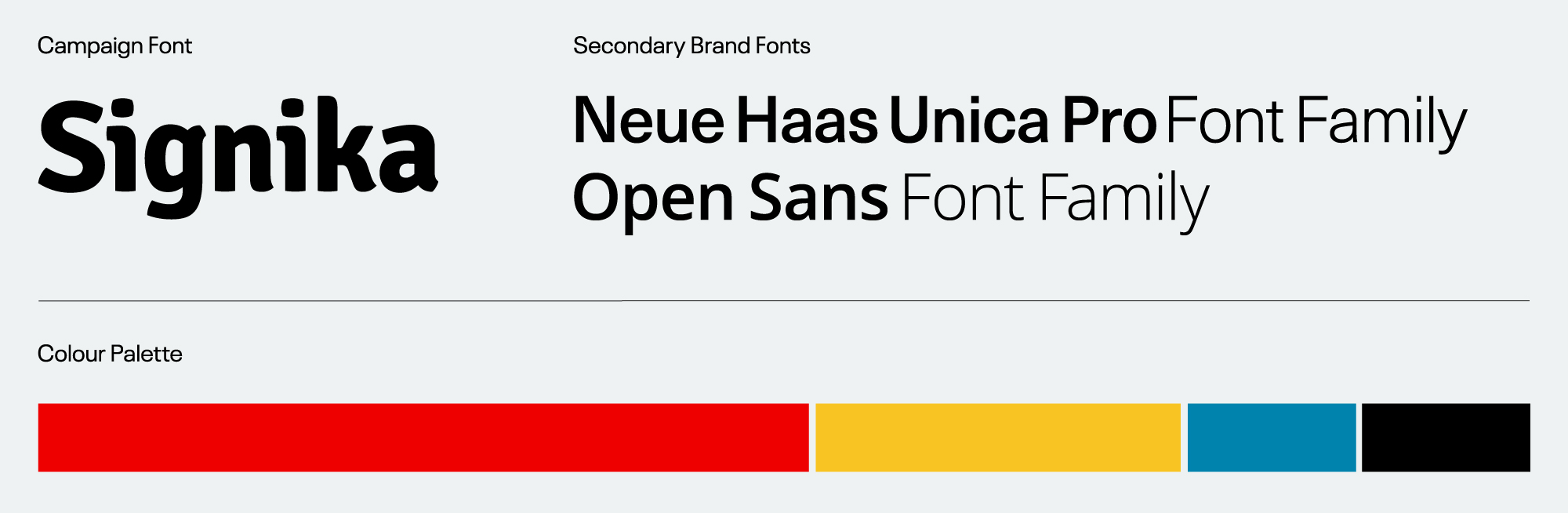
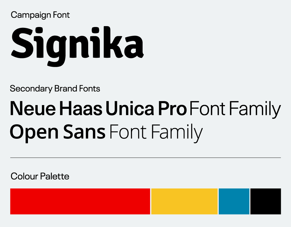
Headlines are set in a Signika, a fun and professional typeface that compliments the Canadian Red Cross brand fonts, Neue Haas and Open Sans.
With this campaign we also introduced a bright and energetic yellow, which complemented the existing Canadian Red Cross brand colours while helping the campaign standout as something fresh and exciting.
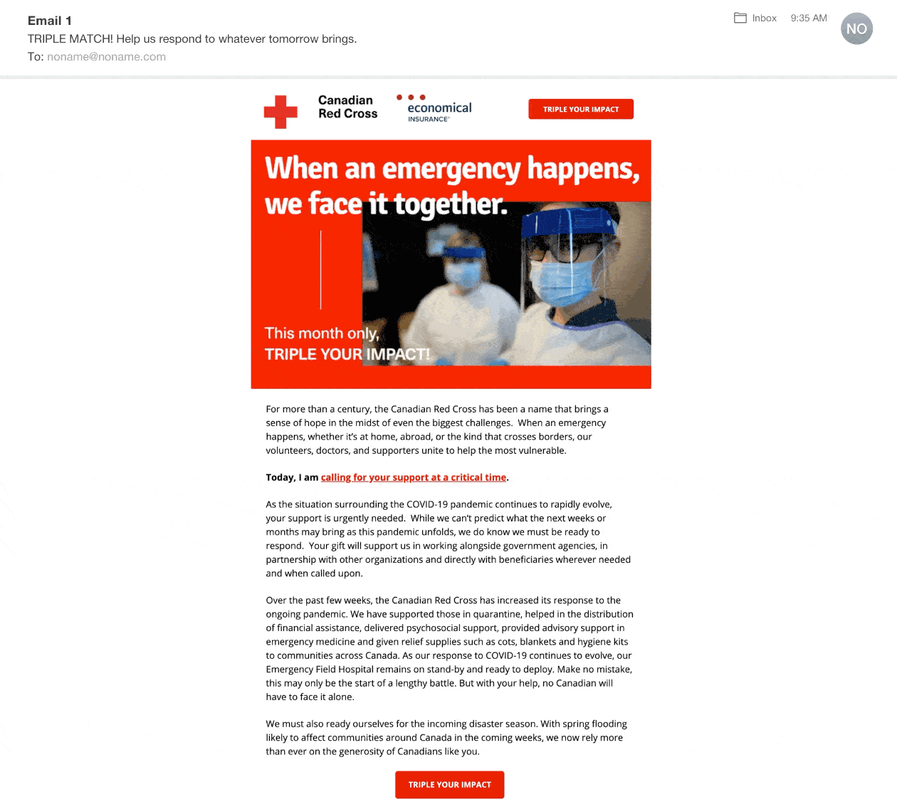
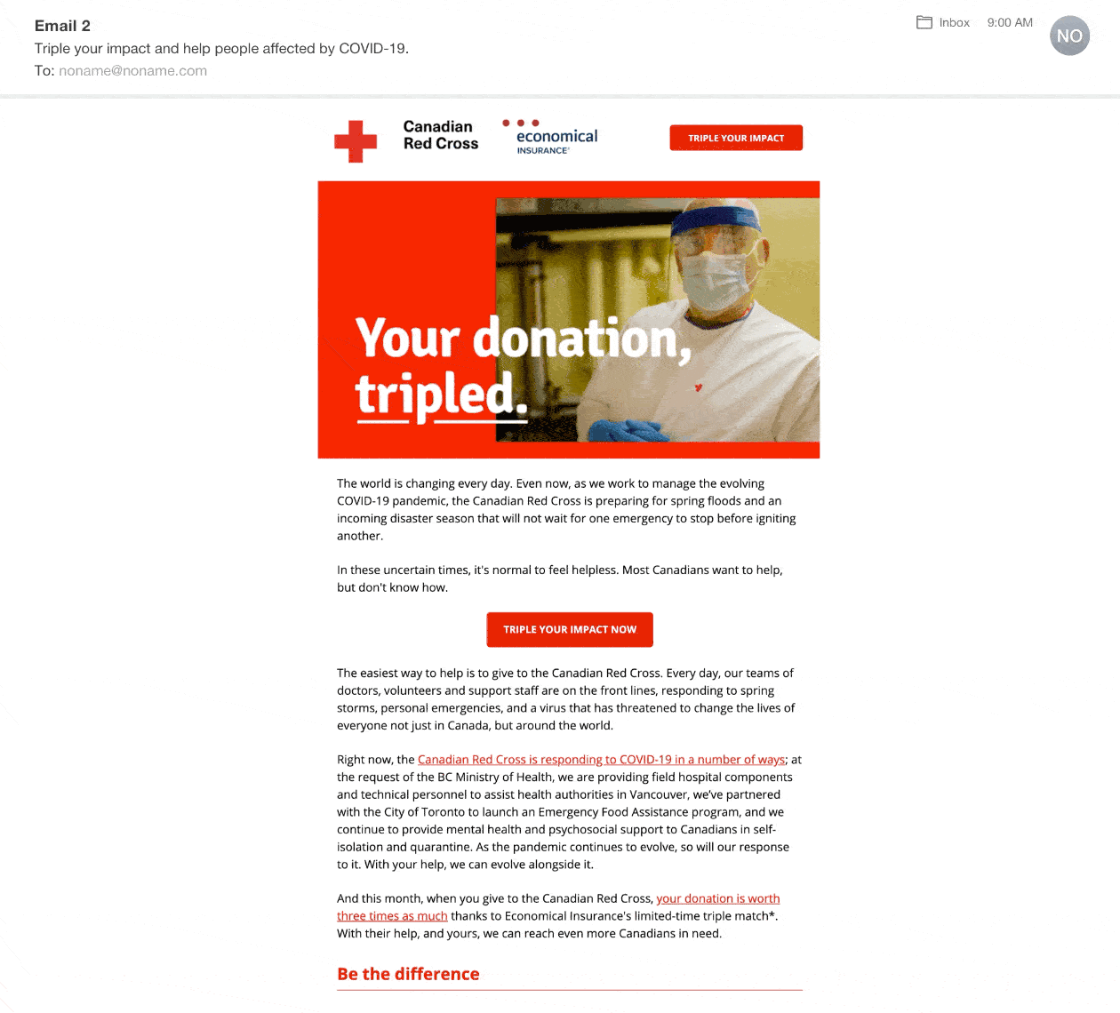
Emails
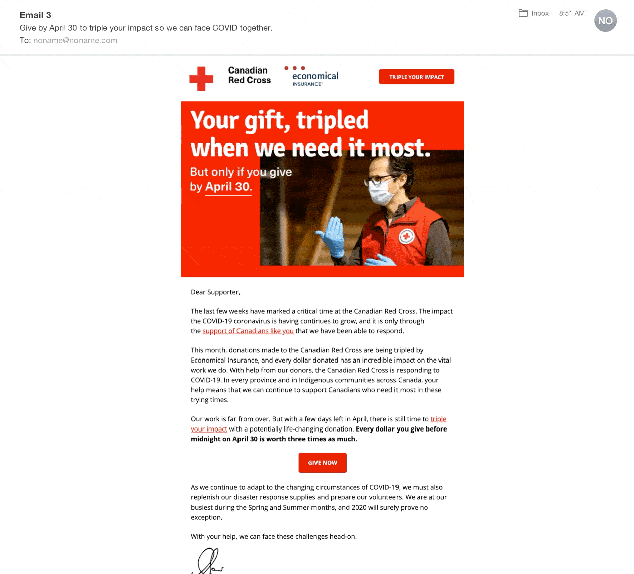
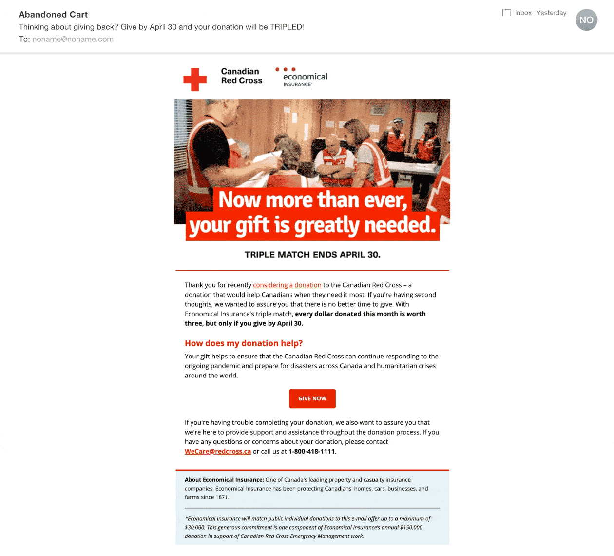
Due to COVID-19, the 2020 March campaign had to quickly be re-worked. Set to launch in April, we spend much of the initial first wave in March pivoting the campaign to reflect the pandemic’s “New Normal” and to communicate to potential donors the image they have in helping the Red Cross respond to this new virus. The campaign went onto raise more than $2 million dollars in one month.
Emails
Unbounce Pop-ups

OBJECTIVE
The match campaign is a long-standing campaign that’s been running since 2012. The Match campaign is a key fundraising campaign of the year and runs for the full month of April.
In past years, the Match Campaign’s look and feel has always been refreshed every year. However, this year, I was tasked to create a look and feel that would allow the Match Campaign to stand out from other digital campaigns happening during the year but also had the potential to be repurposed for the next 2-3 years. A style guide was also developed for other designers on the team to use as a starting point for subsequent years.
Tyler Munro
Copywriting
Emily Chan
Creative Direction
Campaign look & feel
The biggest challenge was creating a look and feel that was inherently the Canadian Red Cross but still different than other Canadian Red Cross digital communications. To do this, we introduced different elements such a main campaign font and colour that worked with the existing brand.
Headlines are set in a Signika, a fun and professional typeface that compliments the Canadian Red Cross brand fonts, Neue Haas and Open Sans.
In addition to the Canadian Red Cross brand colours, we introduced Yellow, which works will with the existing colours, is bright, and energetic. Introducing this another colour allows this campaign to differentiate itself from other digital campaigns.